3 Hidden Features In Devika’s Logo
Devika's Delivery manager gives 3 app development tips every founder should know before starting app delivery.
We’ve had this logo for five years.
You’ve seen it on our site. In apps. Maybe even on a t-shirt or two.
But… have you really looked at it?
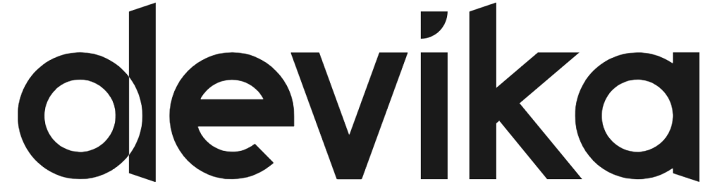
When we created this new logo, we made sure to add references to ideas and beliefs that aligned with Devika’s outlook. So let’s play a little game.
Rules: We’ll give you a starting clue for each reference and an extra hint if you still can’t get it. One point for every reference you can spot! 🕵️
Challenge 1: Think like a coder
It’s hiding in plain sight, and if you’ve ever written it in a line of code, it’ll feel familiar.
Think like a coder
Swipe for hint
Hint: it’s the foundation of every digital system on earth. Two digits. One loop. One line.
Swipe to reveal
Meaning: Binary code, the building blocks of all software, snuck right into our mark. Pretty fitting for a tech company, don’t you think?
Challenge 2: Between the lines
Somewhere in the middle of the word Devika, there’s a subtle symbol of ambition.
Between the lines
Swipe for hint
Hint: You're looking for a number. Just one...
Swipe to reveal
Meaning: A hidden number one, as we are always looking to push boundaries and striving to be the best we can be.
Challenge 3: Flip the meaning
Our logo is built on four core pillars. But to see them, you’ll need to shift your perspective.
Flip the meaning
Swipe for hint
Hint: Do a flip 🔃
Swipe to reveal
Meaning: The "d" becoming a "P" to represent our four foundational pillars: People, pushing boundaries, planet and prosperity
Challenge 4: Open to all
At devika, we are an open organisation and pride ourselves on being an approachable company. This doesn’t change in our logo either.
Open to all
Swipe for hint
Hint: We never cap 🧢
Swipe to reveal
Meaning: the lower case “d” in “devika” communicates our commitment to being an approachable organisation that facilitates collaboration within our internal and external networks.
Bonus Question: Rid of the red
In the rebrand our logo changed from red to a cleaner, minimalist black and white.
Why could this be?
b) Made our logo more adaptable across partnerships
Fun fact:
We haven’t completely abandoned red! Its become something internal, something you only see once you’re working with us and are in the Devika ecosystem.
Scores
- 4/4? You’ve earned your Devika black belt.
- 2-3? Not bad. You’ve been paying attention
- 0-1? Don’t worry, even Ken missed some at first
Thanks for playing!
If you want to see more, feel free to learn about us or look at some of our case studies.